Conversation Upgrade #5 - UK Gas Prices
Caveat: everyone, politicians, journalists, public are doing their best, but we're not using the right mediums to make sense of these problems. Either collectively or individually, we can't use the old tools to solve all of the new types of problems we're facing.
When it comes to natural gas I am basically clueless. I know what it smells like,¹ I know where it comes from (ish) but then I read news articles such as this one which claim that the price of gas is "soaring".
Is it? Just like with fuel oil there's not a single chart in there. Why not? Why not at least link to a data source to support that statement?
The Best Data From ONS
After an hour of searching, data cleaning, etc. here's a graph from WikiSim of the price of gas in UK according to the ONS:
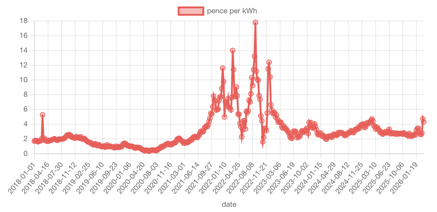
But this data only goes back to Monday 16th (3 days ago). For such an important aspect of our economy is there another data set on the ONS that's current or shows future prices? If there is it would be great for that page to link to it.
Current and Future Prices Data
Another data source I found quickly was from Trading Economics:
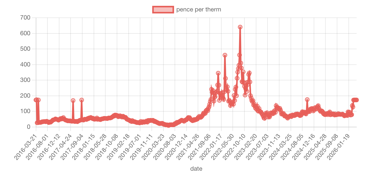
Of course this data is not made easily available for calculations and discussions to support us making sense of our complex world (pretty crucial for democracy).
Soaring Gas Price?
We can now answer that first question: is it soaring? No.
There's been a moderate increase but nothing yet similar to the Covid-19 and the Russian invasion of Ukraine.
And yet we're told it's soaring. What's going on? What am I missing?
Am I looking at the wrong data? I don't know...
How are we expecting the average citizen like me to have a hope of understanding what's going on? __ How do we expect our democracy to function? __
Conversation Upgrade Requirements: Data & ONS
From the perspective of finding the basic data the existing commercial offerings seem okay but critically lack:
- Clear legality for re-use on platforms like WikiSim - I hope this counts as valid educational use vis a vie copyright law
- They need to be contextualisable and they're not:
- Is this the right data to be looking at?
- What else is missing?
- Most importantly: what's the bigger picture, which government actions does this data support or undermine?
- The underlying data needs to be easy to access - it's not. I spent another hour hacking together a simple scraper for it.
Data & ONS: What We Still Need
- Data that's easy to find
- Data that's contextualised already or contextualisable by the crowd (e.g. on a wiki)
- What does SAP (System Average Price) mean?
- Do I want this page?
- Or actually if I'm looking for information about wholesale gas prices perhaps I want this other page xyz.
- Or if I'm worried about my heating bill then I want a totally different page with some citizen's advice.
- Or if I want to know who to vote for I'd need something different again.
- Data that's updated more frequently than every week and that contains future² pricing info.
- Again there's that Trading Economics data but it would be mighty handy to have the ONS publish it instead with the clear legality that would provide.
- Data that goes back far enough.
- Why does the ONS data only go back to 2018? For such a fundamental national resource it would be great to have a longer history of data. I assume there are good reasons and everyone's trying their best.
- Clear units on the ONS data - the ONS data has units but they were buried in the contents page³
Some of this is partially accomplished now that the data is cleaned, made more accessible, and contextualised on WikiSim: Natural gas price in UK. It would be great though to have the ONS publish it in a more accessible way.
Conversation Upgrade Requirements: Journalists
And then in the news articles we'd need:
- at the minimum a link to the underlying data that the news article is making claims about
- ideally an actual graph of the data
- then of course we'd realise it wasn't soaring, but had increased moderately
- and then we might have a conversation about energy independence, energy security, how we might better collectively flourish.*
*The article poses (a partially rhetorical) question:
Will the Iran war prove a turning point in Europe achieving better energy security?
and
But can Europe - whether that be the whole continent or even just the 27 member states of the EU, with their diverse range of industries, energy requirements and perspectives on renewables - really secure its own energy?
Bearing in mind the article doesn't even provide the basic data I think unfortunately we can say: No. It will leave people confused and some people anxious and others apathetic.
And in answer to the second question: we need to have a national energy balance and plan for the UK. I'm working on updating Professor David MacKay's work from 2009. If you'd like to get involved please get in touch. I assume this must already exist but I haven't found it yet. And if it does not exist for other European countries it would be great to generalise it for them too.
That Kind Caveat Again
We can't hope for our journalists to do this all by themselves even with a team.
This is a hugely complex problem, we need many eye balls to make it shallow.
If our existing sense making and decision systems are failing, then we need to upgrade them.
Building nuclear reactors or 10,000 wind turbines seems to take decades not minutes.
And if you can't even run some basic calculations on cost, storage capacity, etc. then how are you hoping to navigate that question successfully?
Perhaps, Secretly, Nobody Actually Cares?
Err no, what I mean is. If it's a democracy shouldn't people sort of discuss things a bit?
Well of course, full discussion.
And shouldn't they have the facts?
Of course not! They don't want them! Facts complicate things. All that the press, the people, and their elected leaders want to know is who are the goodies and who are the baddies.
I'd like to think that's not true.
But why don't we have these deeper conversations connected to the data?
Data driven news; calculations driving planning; models & evidence driving policy?
Perhaps the journalist knows this complexity puts people off reading the article?
Perhaps most people just want to confirm their anxiety? They don't want to know about the world, or explore how we might change our collective approach to living with it more skillfully?
We Need More Meta-Thinking
But I don't think that's only it or even mainly it. I think the real cause is that we're not doing enough meta-thinking: thinking about how we think. Now some people do a lot but in general I sense that most of us are not reflecting enough on how we're discussing, thinking, organising and making decisions.
These are big problems, surely we need to change our frame of reference, frame of expectations.
Why am I even expecting a journalist, with all the pressures and expectations on them from our current information ecosystem, to be able to gather all the related data, clean it, contextualise it, implement all the relevant calculations / relationships / constraints, and then explore that potentially vast high dimensional space to find paths forward and then finally wrap those in compelling narratives?
Phrased like that it becomes to me totally ridiculous, laughable even, to expect anything of substance from any small group of people on a topic so complex.
Have I got it wrong? Tell me please.
Postscript
I did end up finding a graph on a (BBC) news article:
If this bit on the right is huge, what do you call the other bit on the left?! #energy #adjectives
— AJP (James Phillips) (@ajamesphillips.com)March 19, 2026 at 11:16 PM
[image or embed]
Notes
² I'm not confident I really know what "futures" markets are or if I'm using the term correctly but I assume it's the price someone is willing to buy/sell something in the future.
³ The ONS data has units but they are:
- not on the main page
- not on the first page of the spreadsheet
- not on the tab in spreadsheet with the table of data
- not on notes tab
- but in the contents page of the spreadsheet, which is a strange choice.
- units are first classed - there's an option to set the units for different pages.
- it's a Wiki so anyone could contribute improvements (or regressions) to either the units field or the description or the data itself! Could we have something similar for ONS?
⁴ As another aside, the article mentions:
More than 30% of China's final energy consumption now comes from electricity, compared with just over 20% globally, and less than a quarter in the EU.
Now this is interesting. First that's <25% for the EU, which is not far off the 30% for China. Why express this as "less than a quarter"? It seems like trying to make it sound worse than it is. Why not just say "30% in China, 20% globally, and 24% (or whatever) in the EU"?
Secondly, again, where are the sources for this data? I've added the links above. They point to a WikiSim page I've made from this article but it would be great to have the original data sources linked in the article.